What is GenCost?
GenCost is a leading economic report for business leaders and decision-makers planning reliable and affordable energy solutions to cut emissions in line with Australia's climate policy goals.
Published annually in collaboration with the Australian Energy Market Operator (AEMO), GenCost offers accurate, policy and technology-neutral cost estimates for new electricity generation, storage, and hydrogen technologies, through to 2050.
GenCost is highly collaborative and transparent, leveraging the expertise of energy industry stakeholders and involving extensive consultation to ensure accuracy prior to publication.
[Music and animation plays.]
Narrator: How does the Australian energy market plan for future electricity generation in Australia?
[Inside the outline of Australia, we see a scene, travelling along a road to the future with the sun rising over the hills in the distance.]
Narrator: New and changing technologies, increasing energy use, and the transition to net zero emissions, all create a complex, changing landscape of cost-drivers.
[Transition through the shape of Australia to settle on a uniquely Australian landscape with a growing city in the distance. An array of graphics appears on frame in time with the voice over, illustrating; technology advancement, increasing consumption, policy-making/regulation, and renewable energy usage.]
Narrator: Each year, after energy sector consultation, CSIRO publishes the Gencost report, to provide unbiased, accurate and up-to-date cost data for the future.
[Transition to a row of silhouettes of several generic reports. Data streams feed into them from all sides, with icons embedded in the data-streams representing; neutrality, accuracy, consultation, scientific method, research, and economics. The report in centre of frame lifts forward, revealing it to be the CSIRO GenCost Report.]
Narrator: As we work to reduce our emissions, business leaders and policy-makers need high-quality data from reports like GenCost, which is based on global evidence and real-world projects.
[Transition to follow a declining chart-line drawing closer to a horizontal line labelled “Net Zero emissions”. Along the line, a number of points reveal the key decision path that takes us there. Along the path we see people (decision-makers, economists, business-leaders and community).]
Narrator: The GenCost Report presents cost estimates of building new electricity generation and storage projects, and hydrogen technologies, up to the year 2050.
[Transition back to the GenCost Report opening, revealing pages containing text, diagrams and graphs, floating in space, with the words “Generation” and “Storage”, against a timeline to 2050.
Narrator: This includes coal, natural gas, solar, wind, nuclear, bioenergy, hydrogen electrolysers, and storage such as pumped hydro, and batteries.
[Transition to a collection of icons representing each of the technologies, in three categories; “Generation”, “Hydrogen” and “Storage”. Labels under each of the icons in the category of “Generation” read; “Coal”, “Gas”, “Solar”, “Wind”, “Nuclear”, and “Bioenergy”. Labels under the icon within the “Hydrogen” category reads; “Electrolyser. Labels under each of the icons in the category of “Storage” read; “Pumped Hyrdro” and “Batteries”.]
Narrator: The report includes capital costs and levelised costs.
[Transition to a split screen showing two types of data with the labels “Capital costs” (a dashed outline of a energy plant) and “Levelised costs” (a grid of smaller energy plant/facilities of different types, each in a different colour).]
Narrator: Capital costs provide the investment cost of the equipment, land and installation, and are used in planning.
[The capital costs side expands to fill the frame. The dashed outline of the plant fills as it is constructed by cranes and building equipment. A graphic representing money and a bank materialises with a green tick appearing on its top-right corner.]
Narrator: Levelised Costs combine capital costs with the running costs, such as operating, maintenance and fuel, in units that enables us to compare technologies side by side.
[The levelised costs side returns and expands to fill the frame. Icons appear to show the cost inputs, representing: operating costs (a cog with a dollar sign in the centre), maintenance costs (tools with a dollar sign in the centre), and fuel costs (a truck with a dollar sign in the centre). A line-graph builds on below the plant facilities containing different costs over time for each colour) in a way that shows they can be compared.]
Narrator: International influences such as gas supply and global supply chains for equipment can impact capital and running costs.
[A spinning planet earth with four small icons around it representing shipping, air transport, oil and gas, slide down above the words "Levelised Costs".]
Narrator: GenCost also looks at system level costs. The model helps us to find the lowest cost combination of generation, storage and transmission to meet Australia's future electricity demand.
[The scene transitions to an empty frame. One by one, circular icons representing coal, gas, wind farm, offshore wind, hydro, nuclear power plants, hydrogen electrolysers and battery storage, appear across the frame. Between them, small groups of city buildings, towns and industrial buildings appear. Transmission pylons with yellow arrows appear indicating the flow of electricity between all the energy generation methods, storage and consumers.]
Narrator: CSIRO's simple electricity model then helps to find the lowest cost combination of new generation, storage and transmission.
[A vertical green bar appears on the right with the label "System Level Costs" below it. Some of the generation and storage icons fade out to represent a particular combination highlighted. The green bar drops to indicate lower system level cost for that combination.]
Narrator: From this, we can estimate the average future cost of electricity across the system.
[Then a different combination of icons is highlighted and the green bar rises to indicate a higher system level cost for that combination.]
Narrator: Generation costs matter, but they make up only part of what households pay for electricity.
[The scene transitions to a house. An electricity bill pops up from behind the house, to rest above it. The bill contains generic grey shapes representing the text, bar chart and pie chart and a dollar sign.]
Narrator: About 33% of a bill comes from generation, 7% from transmission to our towns and cities, and 35% from distribution to our homes.
[The pie chart expands into the centre of frame. The house shrinks down to the centre of the pie chart. We see graphics representing generation, transmission, and distribution appear around the pie chart, each with a text label below them. The slices of the pie chart are positioned to be closest to their related graphic, with a small line connecting each graphic with a slice. A power plant building, wind turbine & solar farm panels, with the label "Generation" and "33%" appear next to the large red slice. A transmission pylon with cables, and the label "Transmission" and "7%" appear next to the thin yellow slice. Three local power-poles with cables attached to a house, and the label "Distribution" and "35%" appear next to the large green slice. ]
Narrator: The remaining 25% covers items like metering, retail services and efficiency programs.
[A graphic appears next to the remaining slice containing an electricity meter, a technician, and a bar chart, with the label "Other" and "25%".]
Narrator: Importantly, GenCosts data is transparent and publicly available for free.
[Transition to a montage representing researchers collected and analysing information, new ideas coming in, with feedback (speech bubbles and paper submissions) coming from industry and consumers (business, industrial, and residential buildings) and dropping into the central collection of information.]
Narrator: The GenCost Report plays a vital role in helping decision-makers to plan and build reliable and low-cost energy solutions to power the future of Australia.
[Pull back out to the GenCost report forming to rest in centre of frame, surrounded by the shape of Australia, with people around it (decision-makers, economists, business-leaders and community).]
Narrator: To find out more, visit: csiro.au/gencost
[Transition to text on a white background, reading: “The GenCost Report” and “To find out more, visit: csiro.au/gencost”]
[Music finishes and the CSIRO logo appears with the text “Australia’s National Science Agency” against a white background.]
Resources
- GenCost 2025-26 Final Report
- GenCost 2025-26: Renewables and storage a source of stability amid global uncertainty
- GenCost 2025-26 Final Report - Executive summary
- GenCost 2025-26 Final Report - Appendix D
- GenCost 2025-25 Final Report - Accessible version
- Infographic: 2030 LCOE range and futures prices
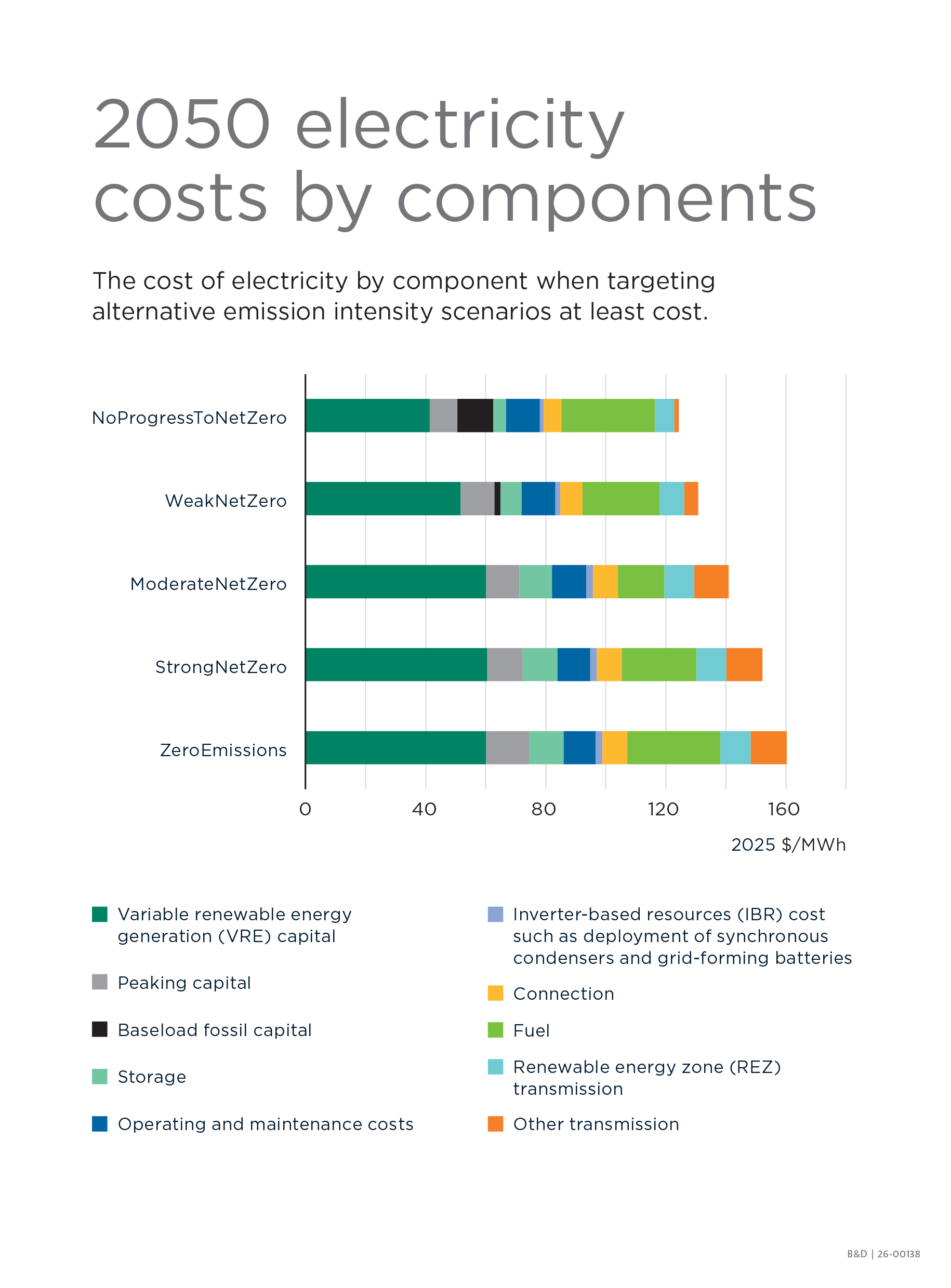
- Infographic: 2050 electricity costs by components
- Infographic: 2050 LCOE range and SLCOE estimates
- Infographic: Capital costs of batteries and gas turbines